GM Photography:
Logo Design
To view the full case study, please consider checking out this page on desktop!
Project Overview
Project Type: Contract Position
My Role: Graphic Designer
Project Duration: August 1, 2022- August 22, 2022
Tools: Procreate, Adobe Illustrator, Figma
Context:
Client needs a logo designed for their nature and travel photography company, Gianna Michele Photography. I established initial communication with the client to get a broad understanding of the company, branding, and the scope of the project. From this a creative brief was established based on the client's requests. The following information was summarized from this brief:
DESIGN REQUIREMENTS
-
Produce a logo for their nature photography company
-
Logo will be used for their website as well as building brand recognition
-
Keep design aligned with their branding and aesthetic: modern, simple with minimal edits, must look good alongside soothing nature photos
-
Incorporate G&M into a digital camera silhouette, specifically the Nikon Z5 camera
-
Neutral colors for the logo
PROJECT GOAL
Create a modern logo that incorporates the letters “G” and “M” into the silhouette of a Nikon Z5 camera. Stick to neutral colors and consider a design that suits the client’s business, which is both photography and nature focused.
Ideate Solutions
In the initial steps of the design process I focused on understanding the client and their needs, as well as defining the problems and goals of the project. With those details clearly defined, I was ready to move into the ideation phase of the design process. To start, I sketched out all my designs using pencil and paper so that I could rapidly iterate and let my ideas flow freely onto the page.
I started my usual design process by taking the letters "G" and "M" that the client wanted incorporated into the logo and deconstructing them into basic shapes and different font types.
My goal with these initial drawings is to map out all sorts of font types, camera silhouettes, and different ideas on how to merge the two ideas into one. At this stage in the process, I try and forgo adding too many other details such as the additional text with the client’s full business name.

1
With my initial pencil sketches drawn out, I decide to move forward and bring my designs into Procreate. I take a few minutes to reflect on the drawings and figure out which elements I would like to bring into the next iteration of designs. From there I begin to draw all sorts of logo ideas using elements I think could work well together.

2
I created a new page to further adapt my designs once the first page was filled. I began to focus on different camera angles that could act as the silhouette to enclose the letters "G" and "M". As well, I brought over some of the “G” and “M” text ideas from the first page to incorporate into these designs.

3
Realizing that the client specifically requested a “Nikon Z5 silhouette” and not just an outline of the camera, I pulled a few of my more favored designs onto a new page. I inverted the coloring so that I was using the negative space to detail the camera. This produced more of a silhouette effect that the client wanted.

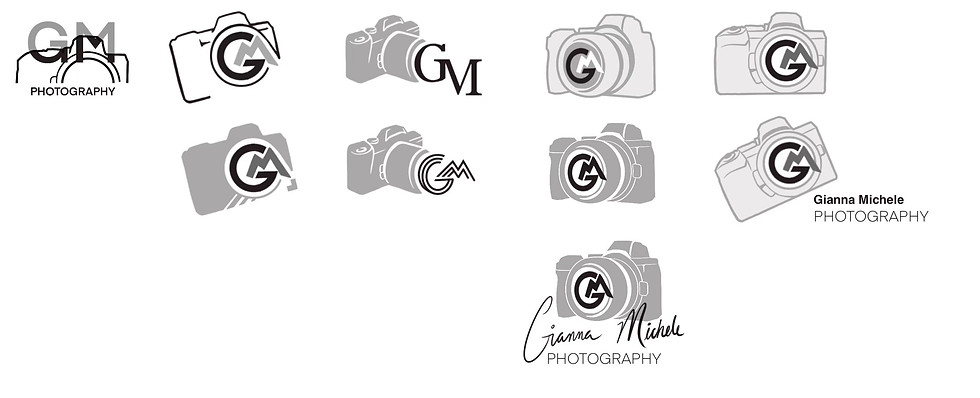
I felt I had a lot of ideas to work with after completing multiple pages of designs. At this point, I copied the best of the logos onto a separate page. The logos, pictured right, were my final designs that I wanted to move forward with before importing them into Adobe Illustrator. Before doing this though, I re-visited my client's brief and the goals of the project to ensure I was adequately meeting the client's requirements and expectations.

Move Designs To Illustrator
I was now ready to re-create these logos into a vector format using Illustrator. I simply placed the finalized Procreate document into Illustrator as a base layer and used a number of different tools such as the curvature tool, shape builder tool, and the line and rectangle tool to trace my designs. I made adjustments to the anchor points and segments before placing these logos in a horizontal row (pictured right, top row).
I wanted to offer my client other variations of the logos in the row below. Next, I made a third row of designs to show different colored versions. And lastly, I provided a text plus logo option to see how these logomarks would look alongside the text.

Color
Color was the next consideration in my designs. Up to this point I worked using shades of black, grey, and white so that the focus was purely on the design of the logo. I didn’t want color to influence how I felt about one design when compared to another that used different colors.
When I reached this stage in the process, I decided to check in with my client and confirm what they meant by keeping to “neutral colors”. I wanted to see whether this meant keeping designs in grayscale, or if they did in fact want colors but wanted me to incorporate more muted tones. The client replied with some inspiration photos of the types of colors they wanted to see (as seen below).

The client provided clarification that they did want color used in their logo, but for the colors to be as muted as possible so that when she used the logo on her website it wouldn't detract from her photography. They also described liking cooler tones, like pictured in the reference photos to the left. From this I gathered that they wanted earthy colors in more muted, cooler tones. I felt a good starting point was to use the color picker right on the photo references provided to me. I made swatches after grabbing a number of colors.
Colors Used In First Draft of Logos:

I used the swatches I had gathered using the images and modified them to find colors that fit the designs best. The amount of colors used is a lot more than I intend to use for my final designs, but at this stage I wanted to give the client a number of different color ideas.
Iterate on the Design
I submitted the first draft of logos to the client and asked which one(s) they liked, or which aspects of the design they’d like me to move forward with in the next iteration. Through this conversation, the following feedback was given:
-
Move ahead with logo #3 as the foundation for our final design
-
Take the camera from logo #3 and rotate it so that it is sitting flat, instead of being on an angle
-
For the color of the lettering “GM”, use the dark green in the letter "G" used in logo #3, and the brown from the letter "M" in logo #1 in the colored section (left).
-
Remove the right corner piece
-
Typography: Find a font that is similar to “high impact”, something that stands out yet is still curvy.
-
Adjust the thickness of the line towards the bottom of the semi-circle that encapsulates the G and M. Thickness should be similar to how logo #3 appears in the “colored” section.
From this feedback, I made the aforementioned alterations. Here is the resulting design:

The typography was the only element that the client still had some uncertainty about. In our previous meeting, they expressed wanting to see different types of aesthetics that they could choose from. Thus I provided the client with different typography options with the logomark. The “proposed logo” that I included is one that I think would best suit the brand. The client also requested a few alternative variations of the logo through using the different parts of the final logo. So I deconstructed the logo into alternative variations, as seen above. The company intends to use these variations for different types of branding.
The client thoroughly liked the changes made to the logomark. But still was unsure which typography option would best serve their needs and fit the aesthetic of the company. Realizing that the client's uncertainty may be impacted because one of the logos was a vertical logo and the other one was a horizontal one, I provided a third draft showing both logos as vertical and horizontal logos (pictured below).

In this draft, I showed what the logos would look like if the fonts were beside or below the logomark. I felt this would strip away any bias towards a font if it was being influenced due to the orientation of logo being vertical or horizontal.
Ultimately, this helped the client make a decision more easily and I made some smaller final adjustments to the logo before sending over the finalized logo.
Final Design & Design Guidelines
Finalized Logo:

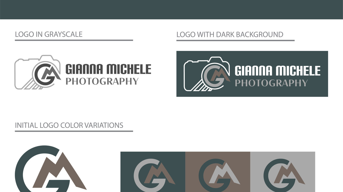
With the logo finalized, I was ready to put together all the logo specifications for the client into the style guidelines. In this document I included the color palette and color codes, typography used as well as specifications for how to use them, logo design variations and color variations, spacing requirements, and mockups of the designs.
The final step involved sending over the Illustrator design files, as well as PNGs of each logo variation. I also provided the client with the style guidelines that I mentioned above.


